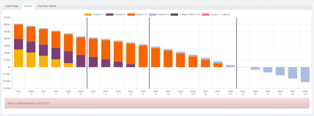
The Assets Chart illustrates estimated end-of-year segment value for all plan years. It will automatically update when plan assumptions are changed. Hovering over the each stacked bar will display the segment value.
The x-axis of the chart shows plan years, by number and by calendar year in which they begin. The y-axis shows projected segment values in $.
Each segment is assigned a color based on order from first income segment to last, then first outside segment to last, then legacy/longevity. This chart provides an easy way to visualize the projected allocation of household assets across the plan over time. Each segment’s color is displayed in the legend above the chart.
You can click on segment names in the legend to hide them from the chart, allowing you to view one or more segments in isolation. This can be a great way to illustrate the segment’s target values during both its growth and distribution phases, re-iterating how time segmentation works to your clients.
If the plan has a funding deficit, the value of the deficit will be displayed in red beneath the chart. When income segments are partially or fully unfunded, the resulting negative segment balances may cause the chart to dip below the $0 x-axis, as shown above.


