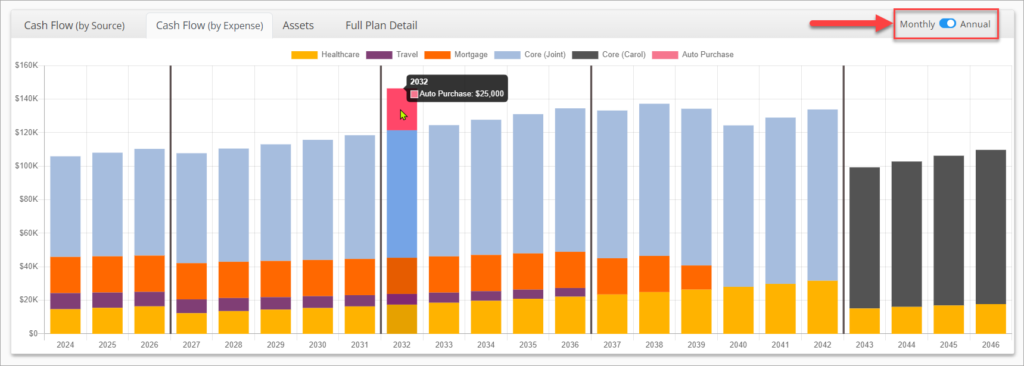
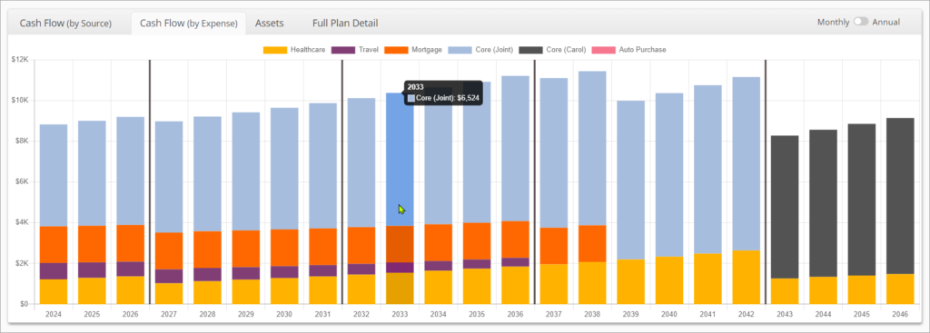
The Cash Flow (by Expense) Chart illustrates planned income by individual expense for every year of the plan. It will automatically update when plan assumptions are changed.
By default, all figures shown when you hover over an expense is the monthly figure for the first month of the corresponding year.
You can also toggle the chart to show cumulative annual figures for each year by switching from Monthly to Annual in the top right corner of the tab. This view can help to better illustrate periods where a new multi-year expense is introduced or ends mid-year, or only lasts only a month or two during a year.

The x-axis of the chart shows calendar years of the plan. Keep in mind that there may be a partial calendar year at the beginning of the plan if the plan starts on a month other than January.
The y-axis shows income in $. It will automatically adjust scale when switching between Monthly to Annual views.
The vertical dark grey lines represent the beginning of a new segment. The divisions between segments can be adjusted in the Segments tab.

Each type of expense is shown as a different color in the chart. The colors will be assigned based on the order of the Expenses. There is a legend at the top of the chart showing which color corresponds to which expense. Even if expenses have similar names, each expense will have it’s own color in the chart.
